Chrysalis Courses
Overview
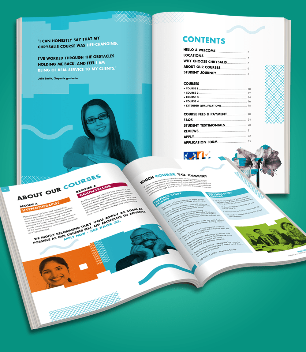
This National Training provider wanted to 're-vamp' their company branding from what was a clean, but slightly clinical image. They wanted to entice people of all ages and diversities to take part in their training courses all over the UK. They already had a working brand but asked if I could 'funk up' their course Prospectus and make it more colourful and attractive to prospective students.
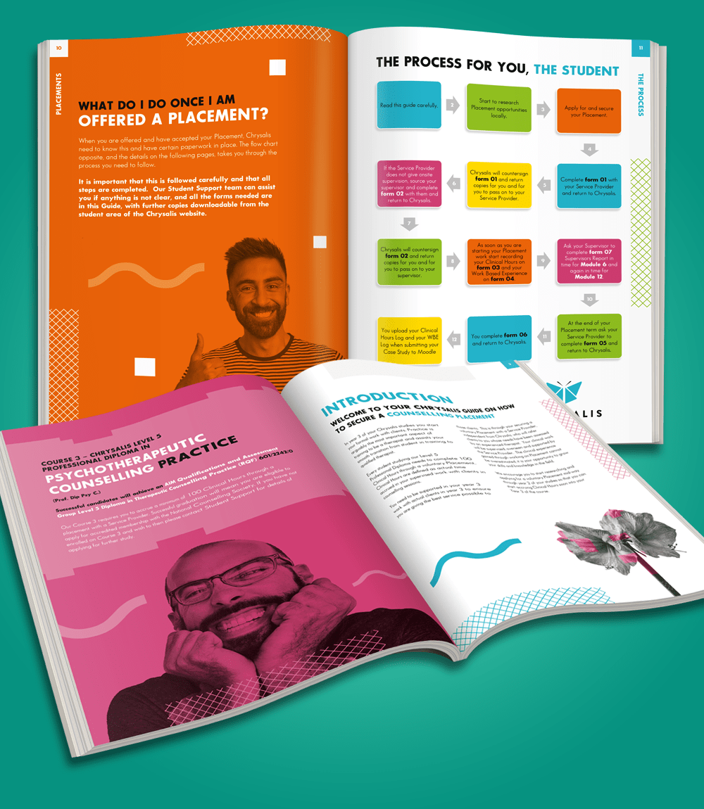
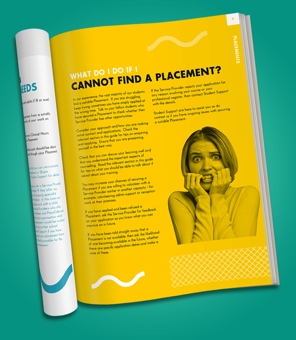
They wanted it to be 'bright and colourful' but also 'informative' and 'easy to follow' - well say no more! Using colours from their existing branding palette I used aspects of their original branding and introduced a mix of block colours and duotone imagery to reflect their diverse market target. Simple typography with lots of 'white space' compliment the bold splashes of colour throughout. A great opportunity to be bold with colour and communicate through imagery.
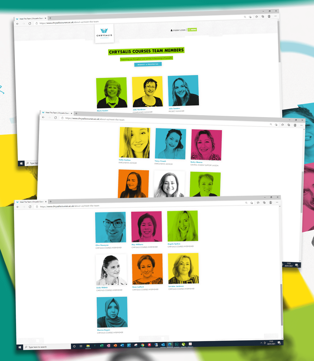
The fresh new look was carried across to their Placement Guide and website which they asked me to produce their Team headshots in the same vein as the brochure imagery. A great team to work with at Chrysalis and I look forward to future projects to carry this theme forward.
- ClientChrysalis Courses
- ServiceDesign for Print | Online Marketing


